Uber Eats · 2019–2020
Bringing new users in through the front door
Using research to connect an unfamiliar app to the way people already understand shopping.
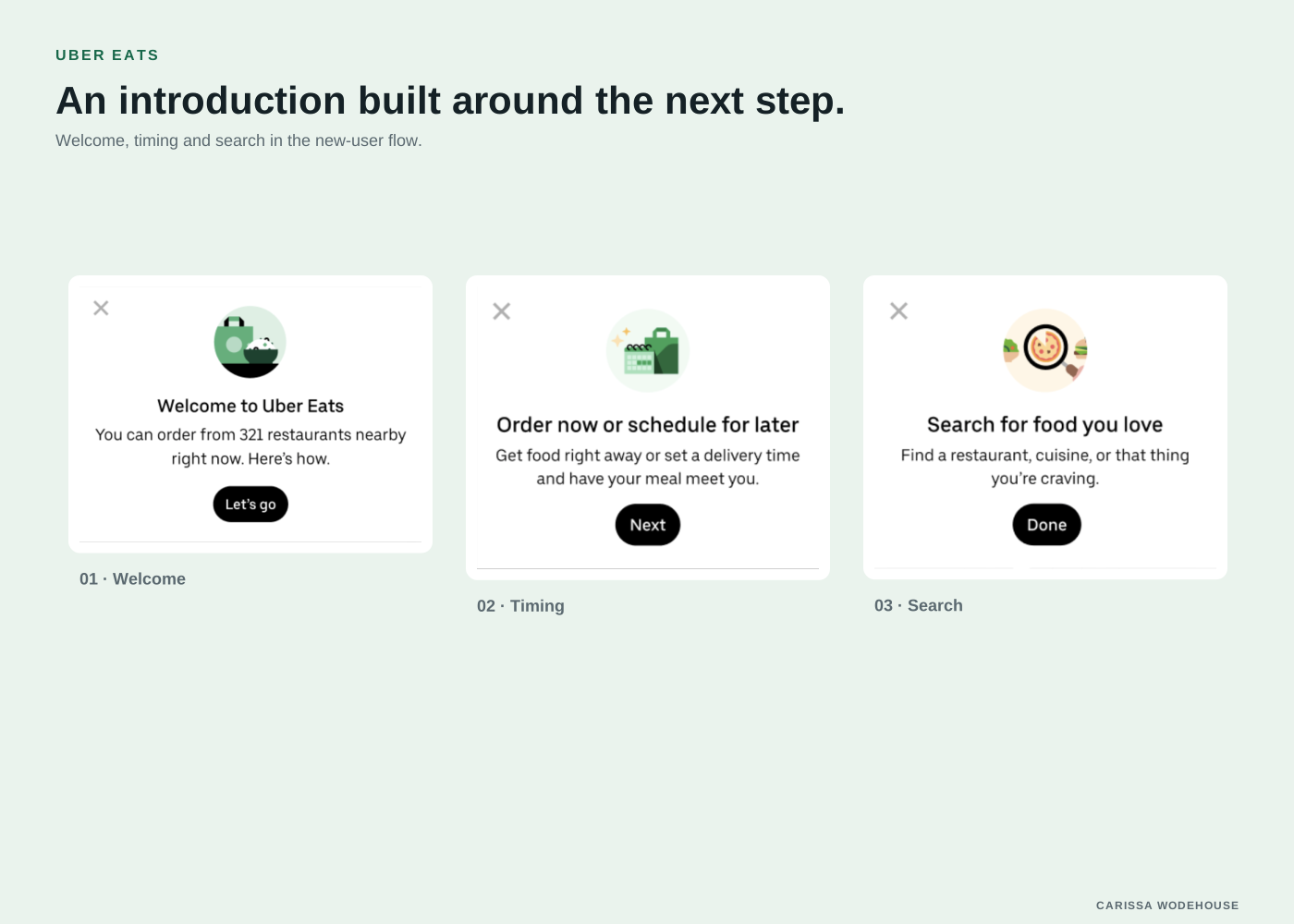 Explore the graphic
 - My role
- Senior UX Writer
- Period
- 2019–2020
- Project focus
- Content design · Product decisions
At a glance
The work in context.
The challenge
An unfamiliar app needed an introduction that matched how people already explored and shopped.
My contribution
Connected research observations to the language and guidance in the new-user flow.
The takeaway
Introduce the experience through a familiar mental model, then help people take the next step.
Inside the work
 View larger
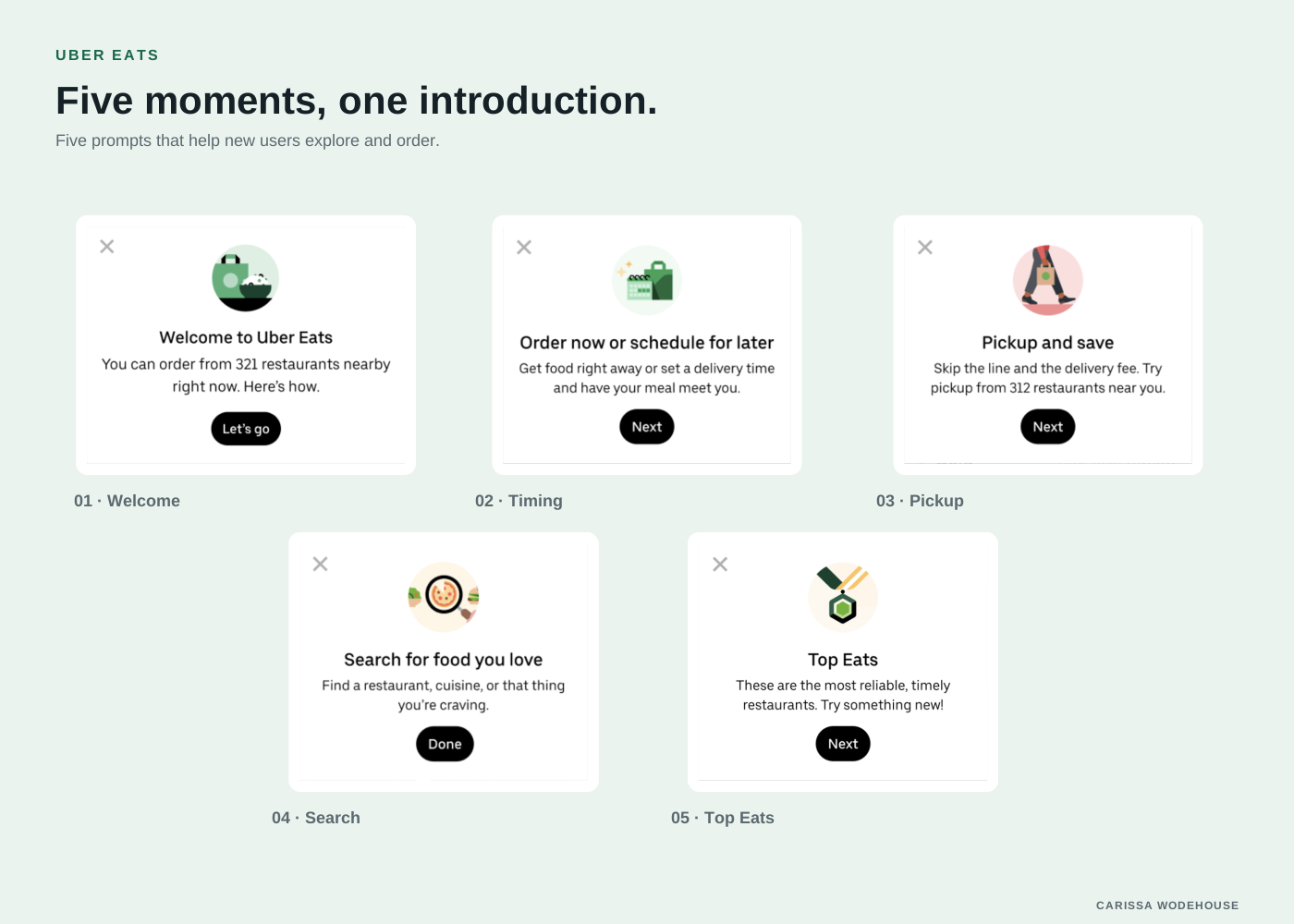
 Five prompts that help new users explore and order.
The challenge
An app can put someone in the middle of a product before they understand how to find their way around it. For people new to ordering online, search and filters are not necessarily familiar starting points.
At Uber Eats, research in Lima helped us see that gap. One participant described opening an app as being dropped through the roof into a supermarket aisle, rather than entering through the front door and finding a section.
That description gave us a useful way to think about the onboarding experience.
My role
I worked as a Senior UX Writer within the product design team. My contribution connected research observations to the language and guidance in the new-user experience.
The work was collaborative. Designers and researchers helped us understand how people ordered food and how that behavior differed from the assumptions in the app.
The product decision
We needed to introduce the experience in a way that helped people orient themselves. Experienced customers may want to search for a specific item immediately. Someone ordering online for the first time may first need to understand what is available and how to explore it.
That distinction mattered when the app saw an influx of new users during COVID. We could not assume that everyone knew what a filter did or what to enter into search.
Connecting language to the flow
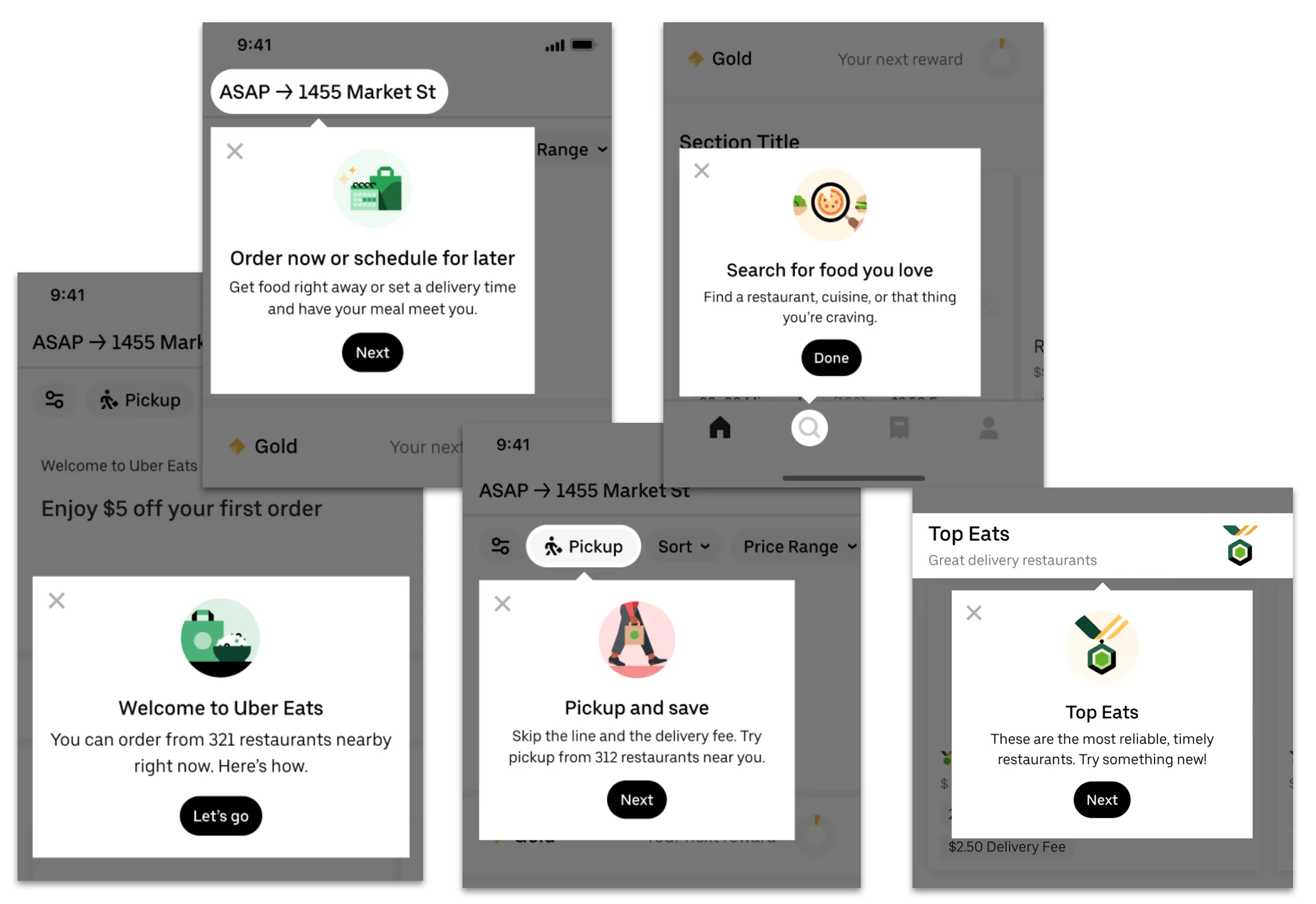
The onboarding messages focused on the action people could take and what they could expect from it. Dynamic information, including the number of restaurants nearby, helped connect the introduction to their own surroundings.
Friendly search prompts gave people a starting point for what to type. The language introduced product behavior rather than describing features in isolation.
View the full flow
What this work shows
Research can change the way a product introduces itself. The useful content decision was to connect the interface to a mental model people already had, then help them take the next step.
The resulting flow connects the introduction to the language and behavior people need to take their first steps.