Quini
Designing a gambling app that feels social
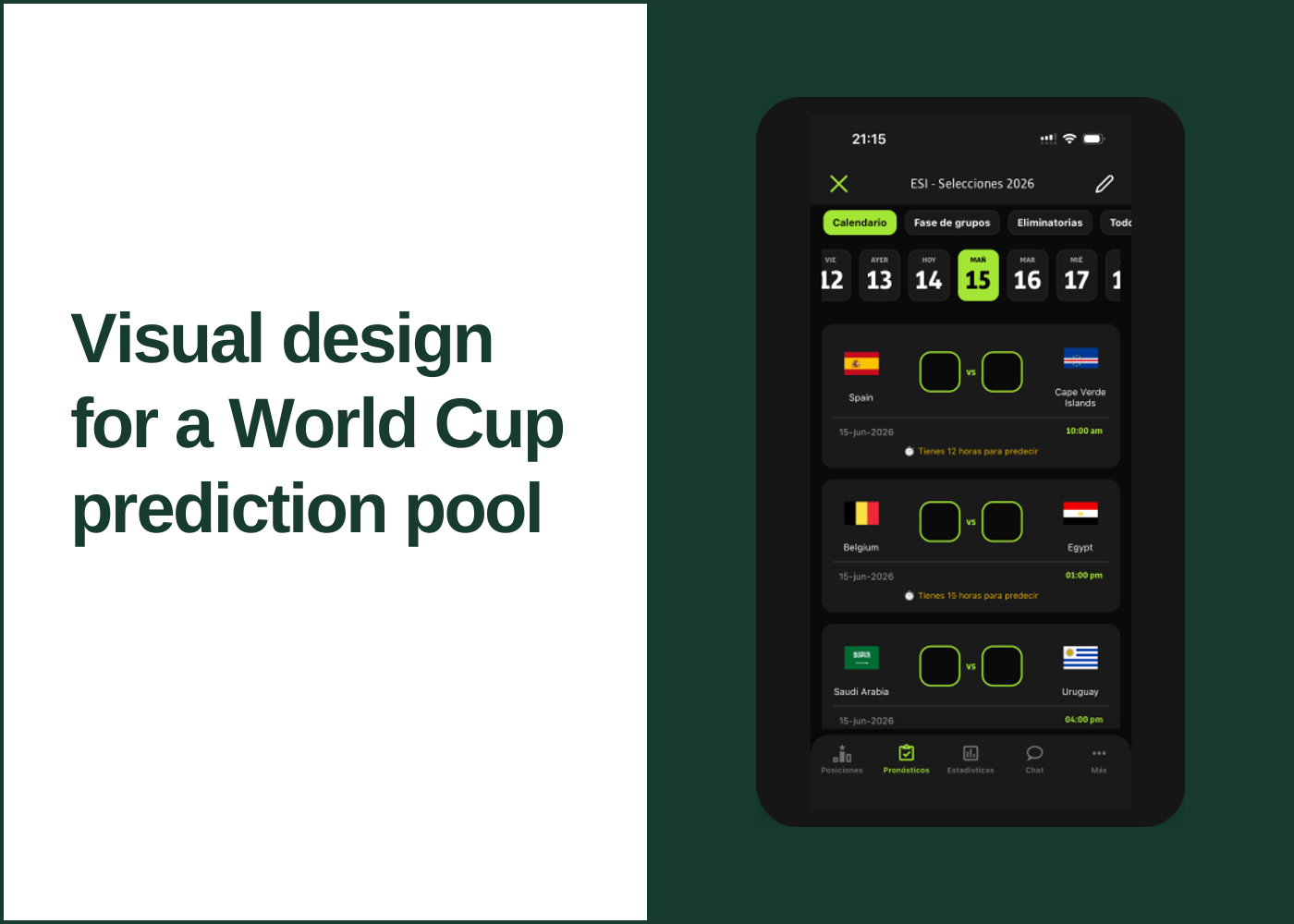
Visual and UI design for a sports prediction-pool app. We were shipping features fast without a design system, so I built one while the product was in flight and carried it across mobile, desktop and email. We went from launch to 15,000 daily active users during the World Cup!
 Explore the graphic
- My role
- Product Designer & Co-founder · Visual design, UI design and design system
- Project focus
The app
Quini is a social betting app for sports prediction pools. I co-founded it with an engineering partner and lead its design. Quini runs in English and Spanish, with users in the US, Mexico, Latin America and Europe, and we went from launch to 15,000 daily active users during the World Cup.
The audience is two-sided. The organizer creates the pool and sets up how the betting works: which part of the tournament it covers, how many points a correct prediction earns, and the rules for the knockout rounds. Organizers are advanced users. Everyone else is a participant: they enter their predicted score for each match and track how everyone in the pool is doing.
Organizers ranged widely. At the top end, enterprise-level users ran office pools for major companies (we could tell from their email domains) and bought our biggest plan, for pools of 500+ people. At the other end were friend groups on the basic package with 3 free users. We had to design for all of it: setup that gives an organizer real control without overwhelming a first-timer, and a participant experience simple enough for anyone in a 500-person office pool.
 View larger
Building fast, drifting fast
We launched and kept adding features quickly, without a design system. Each new screen solved its own problem its own way, and the product started to drift: buttons, cards, spacing and colors that were close to each other but not the same.
While the product was in flight, I created a design system: a dark base, one lime brand accent, and a shared set of components including cards, score inputs, tabs, the day picker, list rows, buttons and the bottom navigation. From then on, new features were built from those established components and brand colors instead of from scratch, which kept the app consistent as it grew and made new work faster to design and build.
The accent carries meaning rather than decoration. Lime marks what is selected (today’s date, the active tab), what you can act on (the primary button, an empty score box) and what is yours (your line on the standings chart). Everything else stays neutral, so a dense screen of fixtures and points stays easy to scan.
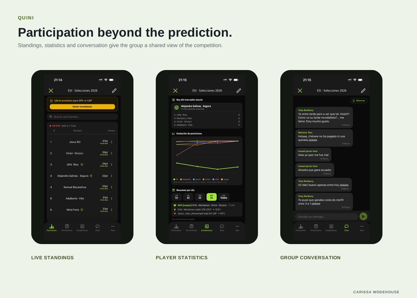
Participation beyond the prediction
Standings, statistics and chat were added as the product grew, and each one was built from the same parts. The standings reuse the list rows, the statistics reuse the cards with a color per player and lime for you, and the chat sits on the same dark base. Amber appears once, for the reminder that some people haven’t predicted yet, so it stands out without being large.
 View larger
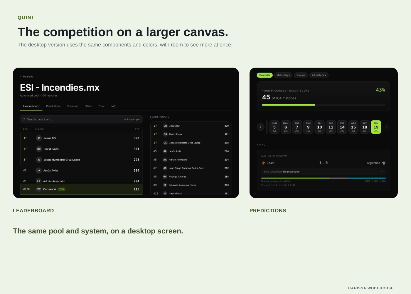
The competition on a larger canvas
We also launched a desktop version. Because the components and colors were already defined, desktop used the same system rather than a separate design: the same cards, score inputs and accent, with layouts that open up to show more matches and more of the leaderboard at once.
 View larger
Carrying the system into email
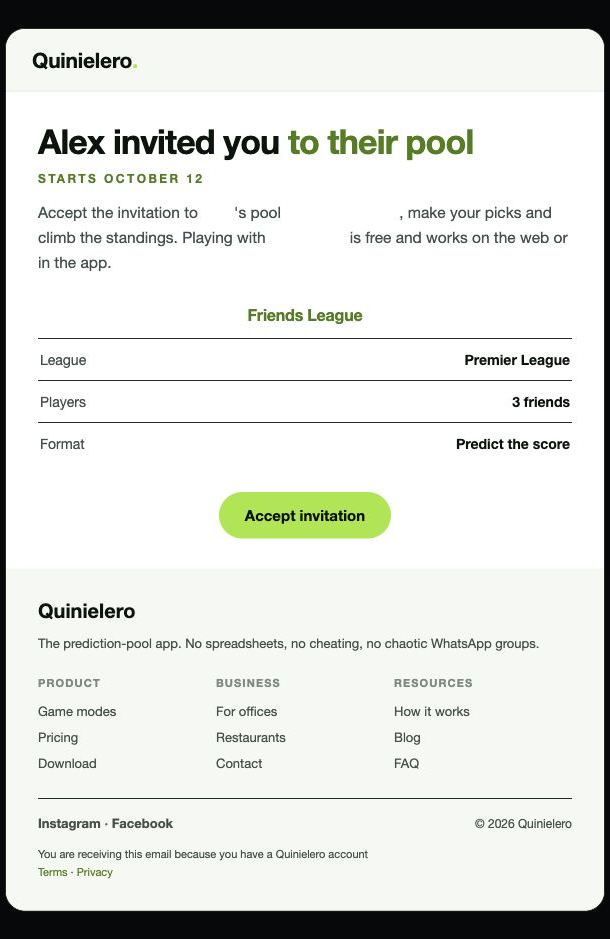
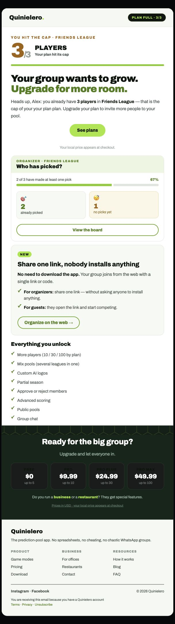
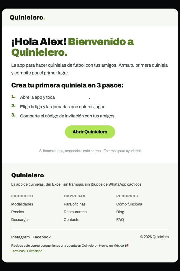
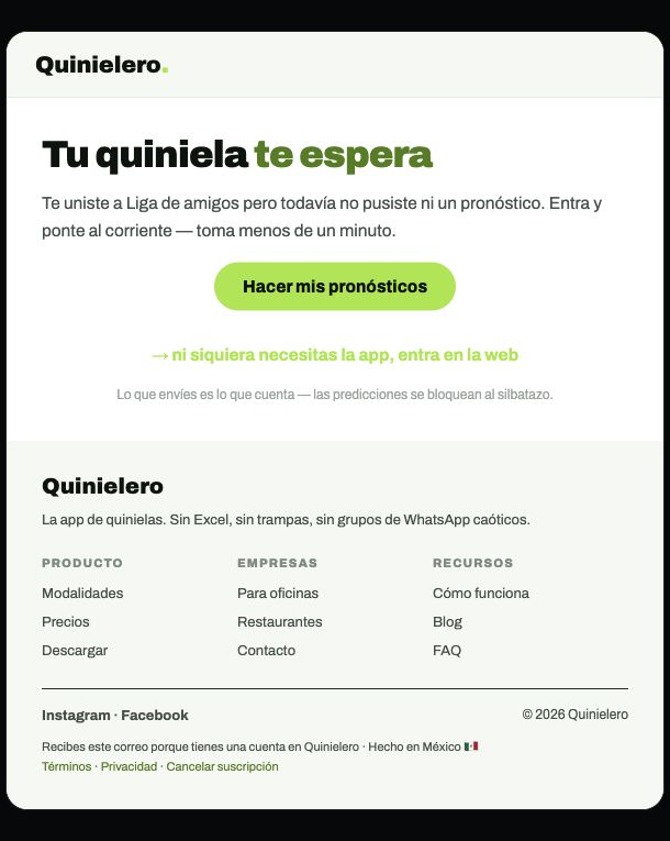
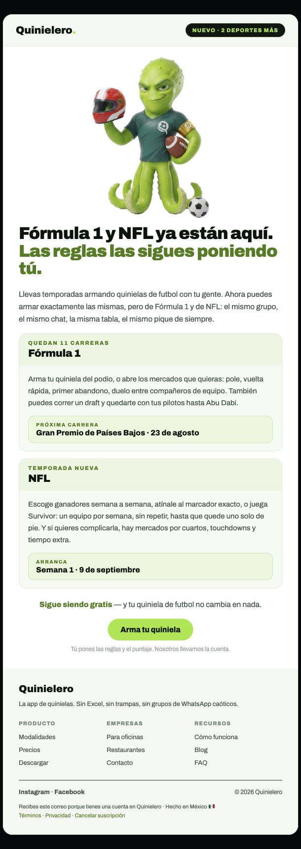
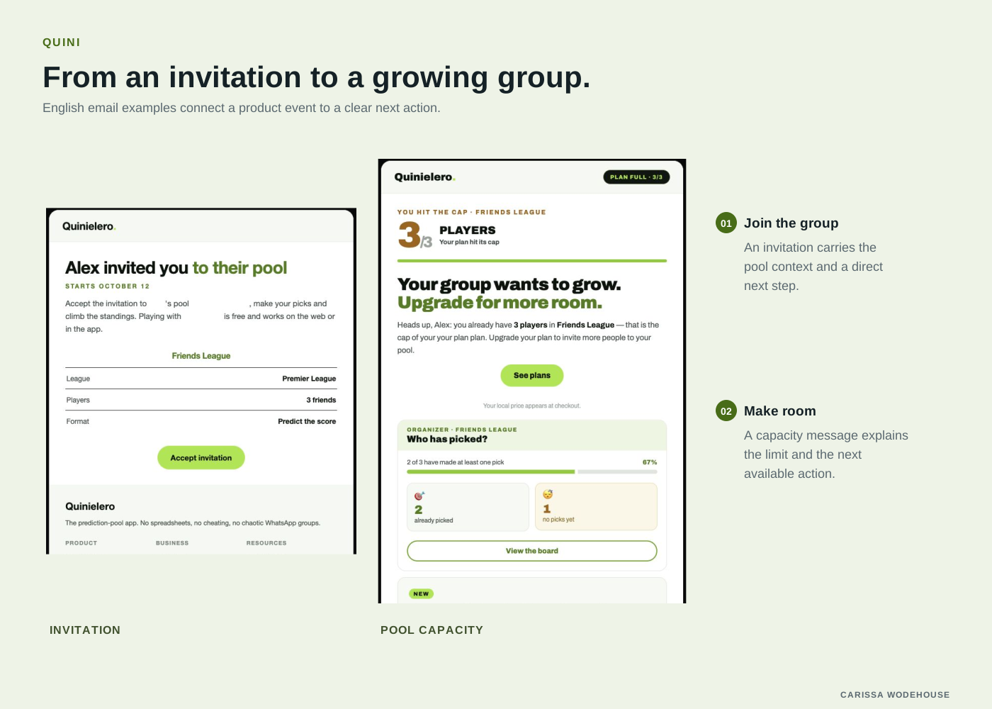
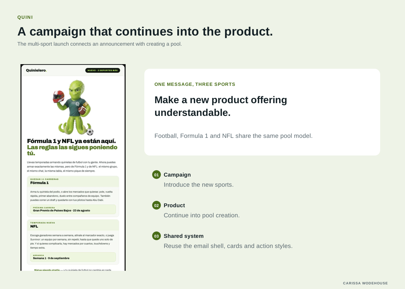
Emails do a lot of Quini’s work: invitations, welcome messages, reminders to predict, notices when a pool is full, and campaign launches. The same system applies there. Mail clients are unpredictable with dark backgrounds, so emails use a light base, but they keep the green palette, the display type, the rounded cards and the button shape from the app. When someone taps through, the product looks like the email they just read. We A/B test lifecycle emails to see which versions bring people back.
 View larger
 View larger
Invitation email · Pool-capacity email · Welcome email · Participation reminder · Multi-sport launch