Meta · 2025
Purchasing approval system
Unified complex purchasing workflows; $20M+ in annual savings and cycles reduced from four months to one.
- My role
- Staff Content Designer · Content strategy, conversation design, and product design
- Period
- 2025
- Project focus
- Shipped purchasing workflow and conversational AI
At a glance
Project summary
The problem
200–300 questions, repeated answers, and unclear progress made purchasing slow and stressful.
My contribution
Led content strategy, mapped workflows, aligned review teams, and took on form and interaction design.
Key decision
Reuse answers, reveal only relevant questions, and show progress in one place.
Outcome
$20M+ annual savings; overall cycles fell from four months to one.
I brought fragmented purchasing requests and reviews into one workflow, with reusable questions, case-specific routing, and a shared view of progress. The work supported enterprise purchasing at Meta. Alongside content design and stakeholder alignment, I took on product design after the product designer left midway through the project.
“You shaped prioritization, operating cadences, and execution strategy, often stepping outside your core CD scope to see complex work through. Your ability to bring teams together and drive alignment truly stood out.”
— CD Manager
The problem
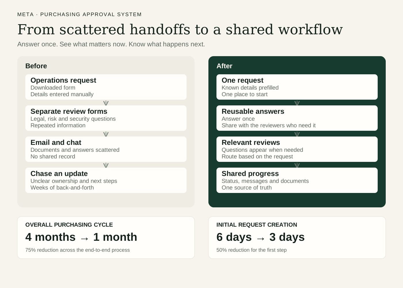
Before the redesign, a purchase could involve 200–300 questions across documents, email, and chat, with weeks of back-and-forth between teams. Requesters had no single place to see the status of their purchase, identify who owned the next step, or find what they had already submitted.
An initial request went to an operations team. Depending on the answers, it could trigger further reviews by legal, risk, or information security teams. Each team had its own questions and often lacked access to earlier responses. Requesters answered the same things repeatedly, sometimes in different formats or language that introduced conflicting information.
Each team had legitimate review needs. But no one had a complete view of the burden those needs created together.
 View larger
Let user feedback set the priorities
Users expressed frustration with how long purchasing took and how many questions they had to answer. That feedback shaped my focus on reducing repeated questions, using information we already had, and showing additional questions only when they became relevant.
Users also showed anxiety about where they were in the process. I made progress and next steps easier to understand so people could see what was happening without having to ask someone for an update.
Mapping the process across teams
I sat down with each team to map the workflow: what information it needed, which answers triggered another review, and what reviewers needed to see from earlier stages.
The challenge was both structural and organizational. Teams owned their individual processes and were not incentivized to improve another team’s results. Moving to a shared workflow meant negotiating requirements rather than simply collecting them.
Answer once and reuse the response
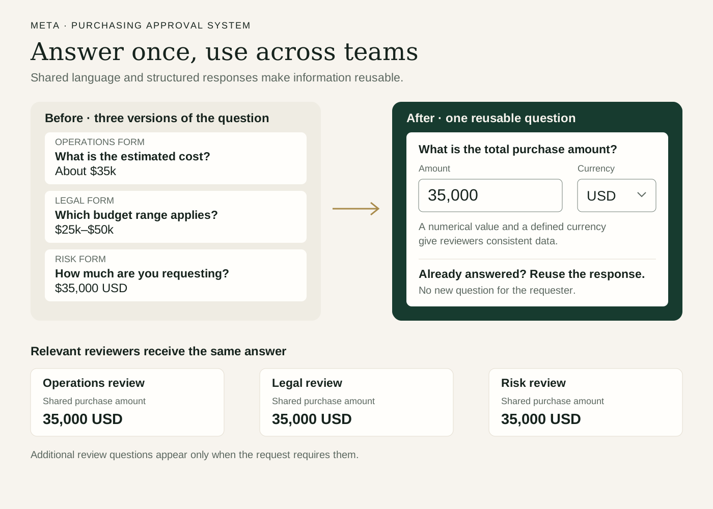
I established common language for reusable questions across forms. This made it possible to recognize when a question had already been answered, hide it from the requester, and still show the response to a later reviewer.
Reviewers needed selected answers from earlier stages, rather than every question in every previous form. The design supported that distinction.
The reusable unit was more than a sentence. It connected the question, its response format, and the reviewers who needed the answer. Establishing that shared structure let teams collect consistent data without repeating the request.
Convincing teams they were asking the same questions took more than explaining the duplication. I put their questions side by side and showed how different wording could serve the same information need.
I also demonstrated alternatives to open text boxes: single-choice questions, multiple-choice lists, and numerical fields. These formats could produce more consistent data that teams could use in dashboards. Working with Engineering, I created a live dashboard and brought it into stakeholder negotiations so teams could see the benefit of structured responses.
The conversation became about how to collect useful information once, in a format that worked for everyone, rather than whose version of a question to keep.
 View larger
Translate specialist language
Purchasing experts sometimes wrote questions in acronyms or language that made sense within their role but was difficult for occasional requesters to understand. Some teams also asked the same thing several ways to detect inconsistencies or bad actors.
I worked through the intent behind those questions and translated specialist requirements into clearer language. The aim was to preserve the information needed for review while reducing ambiguity and repetition.
AI introduced an additional tension: some stakeholders wanted more questions because AI could help them parse the answers. Easier analysis for reviewers did not remove the effort required from requesters.
Ask only what is needed
I identified information that an internal system should already know, such as the requester’s name, unit, manager, or cost ID. About 20% of the questions fell into this category. I flagged these opportunities for integration, and the shipped experience included prefilled information.
I mapped which questions should appear only when an answer made them relevant. For example, a purchase below the budget threshold for legal review didn’t need to show any legal-review questions. The existing approach was to show everything upfront, then remove what wasn’t needed. I reversed that logic: start with what’s relevant, and reveal additional questions only when the request calls for them.
The content principle was to help people focus on what they needed to do now. Displaying a long list of possible reviews and delays could make a small purchase feel unnecessarily daunting.
Create a shared view of progress
The dashboard brought status, submitted information, upcoming steps, messages, and documents into one place. Documents shared through the workflow went into a library, giving requesters a common reference point rather than scattered conversations.
Making that progress visible responded to the anxiety users had shown and helped reduce status inquiries to Operations, whose team members had been receiving constant requests for updates.
We also introduced tracking at the question and section level. Previously, measurement focused on the overall process duration. More detailed tracking made it possible to see where people paused, left, or moved slowly through a section.
Take on product design
The product hosting the workflow also needed rebuilding so future teams could use it for similar processes.
When the product designer left midway through the project and was not replaced, I took on form layouts and interactions, built additional components, and worked directly with Engineering. The designer had established a design system, but it did not include every solution the workflow needed. I guided Engineering on which existing components to use and developed missing pieces.
The scope expanded from the language and logic of purchasing forms to the reusable product that supported them. Reused answers, prefilled information, conditional questions, and the progress dashboard all shipped.
Design an AI conversational experience
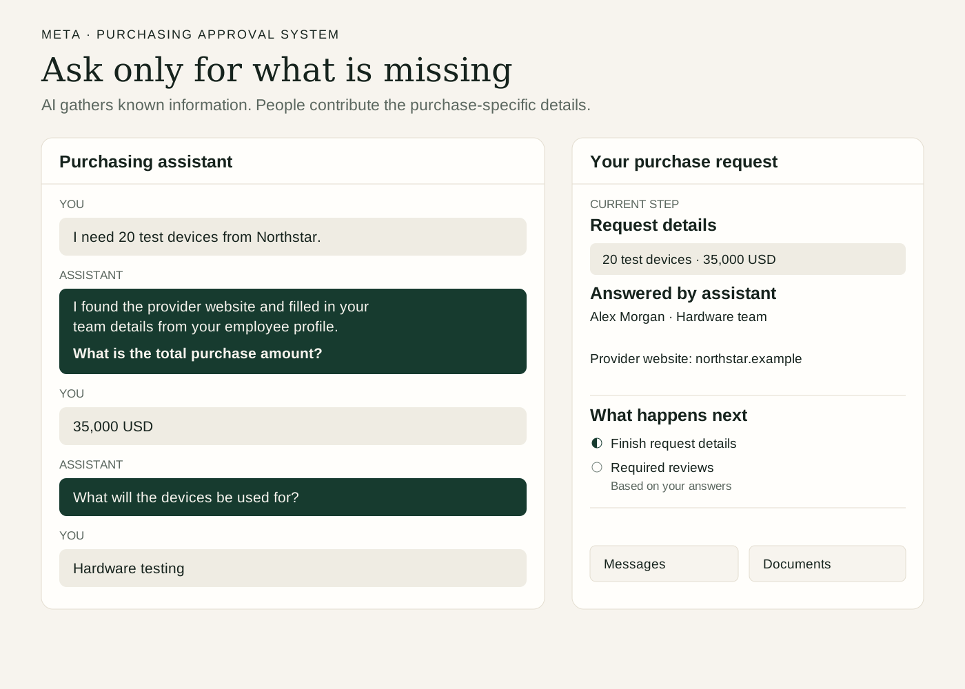
I extended the same principle—ask people only for what is needed—into an AI conversational concept that I presented to design leadership.
For the product team, I reviewed the workflow question by question to identify which answers AI could obtain from a person’s profile or public searches, such as a provider’s website. I handed that analysis to the PM to support decisions about which questions the assistant should ask and which could be answered in the background.
The AI conversational version and background answering shipped. This work connected conversation design to the underlying information requirements, rather than simply turning every form question into a chat prompt.
 View larger
Results
The purchasing project delivered $20M+ in annual savings and reduced the overall purchasing cycle from four months to one, a 75% reduction. Within that process, purchase-request creation—the initial step—fell from six days to three.
Across a purchasing operation spanning $18B in annual spend, the redesign consolidated nine entry points into one. The unified experience gave requesters one place to submit information, follow progress, communicate, and find their documents.
The workflow also introduced question-level and section-level tracking, making individual sources of friction visible alongside the overall process duration.
What began as a test case became the standard for all purchasing teams and was rolled out across them. I built reusable form questions from the outset so the approach could extend beyond the initial workflow.
“She went outside her skillset and core responsibilities to map routing logic and workflow structure, which clarified decision points, routing based on policy and process requirements, and surfaced gaps in our process.”
— Principal Product Manager